Brave the Elements
HAL Matex Release Note
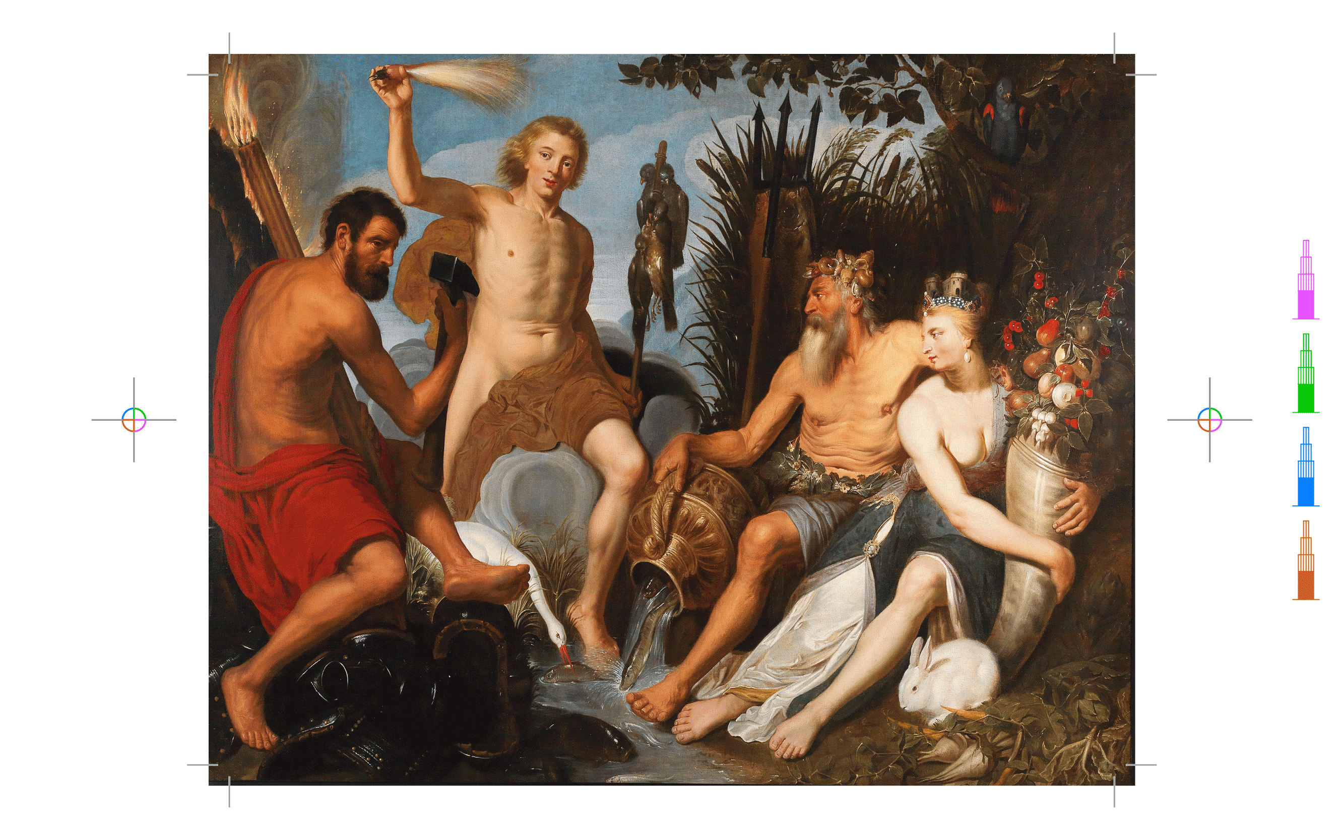
HAL Matex is returns with a serious revamp. After its initial release nearly a decade ago, the typeface is back on the scene with a brand new sequel. We’re not just releasing Matex II, but also III, IV and V, all at once. More on that later. Brace yourself, dear Reader, for a brief journey during which you will encounter an earthquake, ancient philosophies, Adrian Frutiger and much more. Enough foreshadowing, let’s start, as we always do, with a flashback. The tale begins as follows. Once upon a time there was a font…
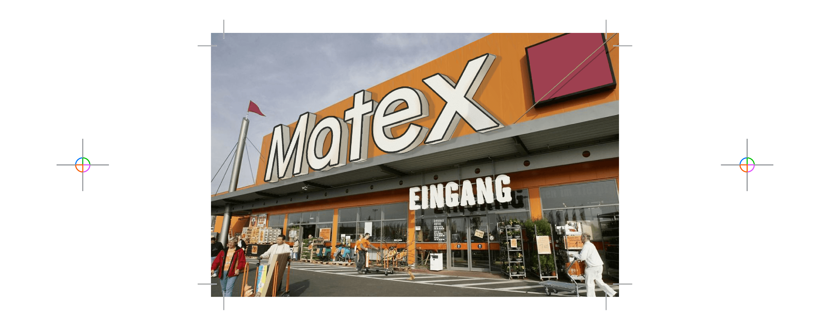
Believe it or not, Matex is our first text typeface we created long before the type foundry’s existence. Scroll back to 2017, the final year of our BA degree. A contributor to a magazine we had just finished designing (an art professor teaching in Quito, Ecuador) invited us to work on a publication for his course. Greenhorns at the time, desperate for any kind of graphic design commissions, we gladly accepted without clarifying any financial details (RED FLAG). Overly eager and zealous, we also decided to create a custom typeface for the project, hence Matex was born (named after the book’s title Materiales Experimentales).
The publication was a hybrid of a catalog and textbook, combining contents from the fields of artistic education, contemporary art and art history. The approach for Matex was similar: a blend of numerous references. The aim was to embody an elementary sense of simplicity, a typeface that feels sort of basic and fundamental. But it should also incorporate some artistic flavour in the form of rudimentary and avant-garde letter shapes. We were analysing a range of inspirations: Helvetica Textbook and Günter Gerhard Lange’s AG Schoolbook as well as Herbert Bayer’s Universal and ITC Ronda by Herb Lubalin & Tom Carnase. At this point, I wish to briefly pay tribute to a whole genre of 1970s Bauhaus-inspired “circular” photo-types: Blippo, Burko, Pump, Harry, Horatio, Churchward Design, Wexford, Washington and obviously ITC Bauhaus by Ed Benguiat and Victor Caruso, to name a few. Gotta love them all <3.
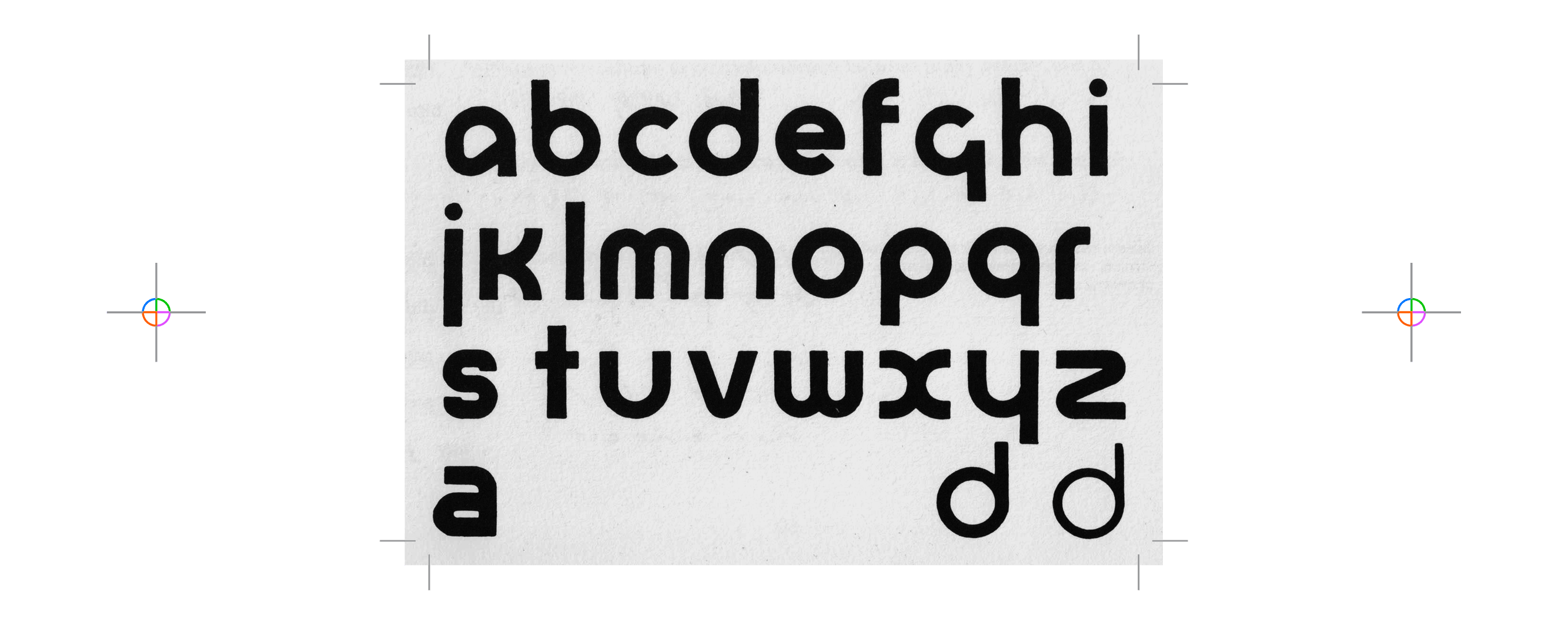
Matex was drawn to harness and straddle these visual associations and roll with them. The result was a pure and legible sans-serif with a comfortably high x-height. Matex became a sturdy text face with clean, stripped-down and straightforward letter shapes: reduced, unadorned and free from unnecessary visual clutter. At first, it only existed in one weight for the book’s typesetting. Six months later the entire layout was finished, but then from one moment to the next our commissioner ghosted us. Unfortunately, we never found out why but our hope for the project’s realisation dwindled with every ignored email. In German we say: one pays with Lerngeld (literally translated to “learning money”) in situations like these, meaning at least the experience teaches the valuable lesson to not make the same mistake twice—and trust someone on the other side of the planet on the basis of some emails.
OH FUCK THERE WAS JUST A HUGE EARTHQUAKE. GODDAMNIT. ok – not huge – but terrifying – nothing fell… jesus christ… tremors now – ok gonna sign off will send more info shortly i’m on the second story and going to go down into the plaza
These are the last words received from our scammer. We never heard from him again. [Editor’s Note: He is alive and well, according to social media.] Lesson leaned, moving on… We were left with some disappointment and many hours of unpaid labor but the brighter side of the cloud’s silver lining: we had gained an interesting and original typeface design, which we used for many projects since. Later, Matex was extended to several weights and was part of the inaugural catalog of HAL Typefaces in 2022.
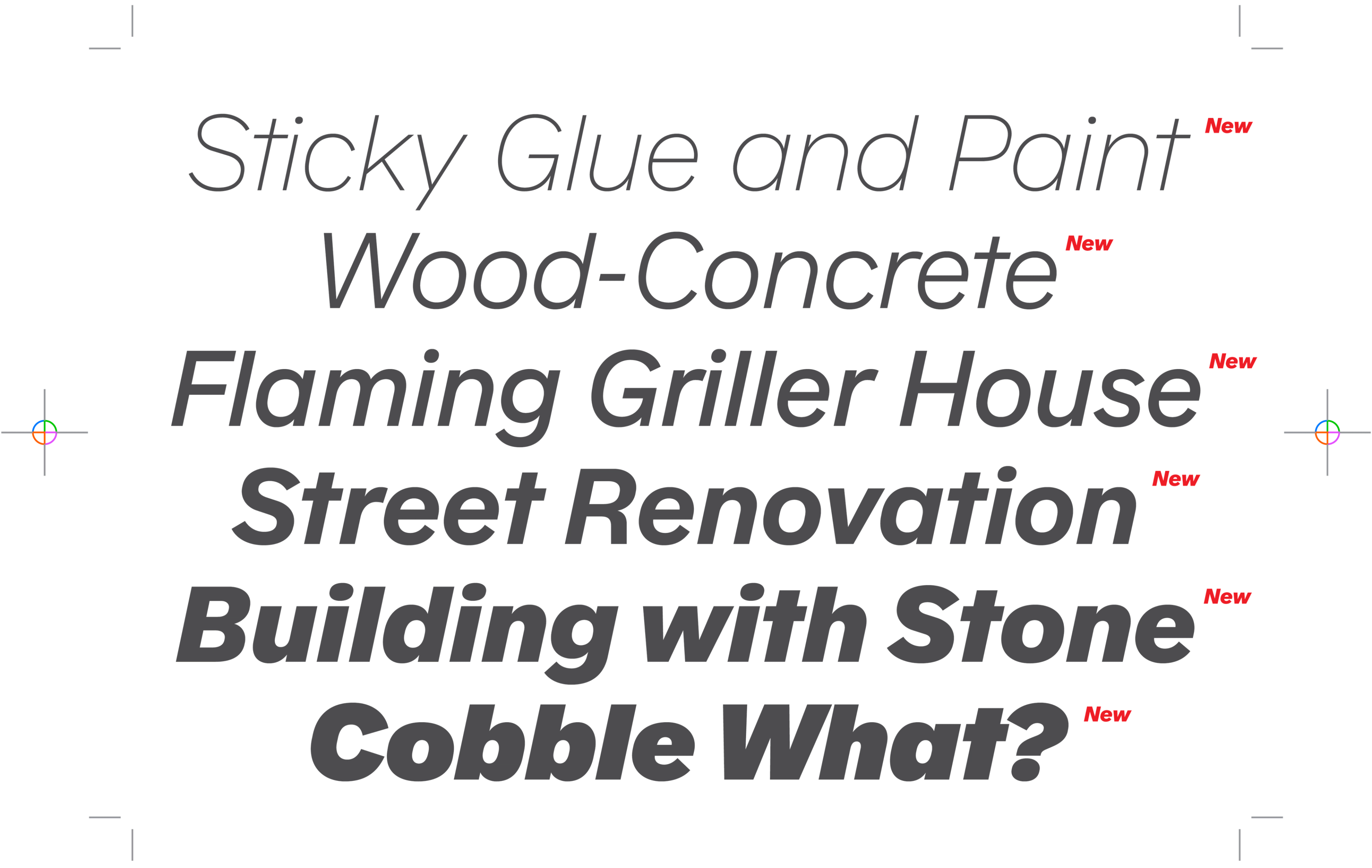
Since the foundry’s launch, Matex has been a reliable and trustworthy companion, always performing and delivering when needed. The typeface’s productivity has been relatively stable and respectable. However, its lack of italics left us wondering if its full potential is truly satisfied. We have received abundant queries on the availably of an italicised Matex. Furthermore, a potpourri of additional stylistic alternates had accumulated over the years. And they were somewhat callously spread across a number of stylistic sets. Matex was in need of a proper facelift, a deep cleanse—a new vision was necessary to really update and upgrade the typeface.
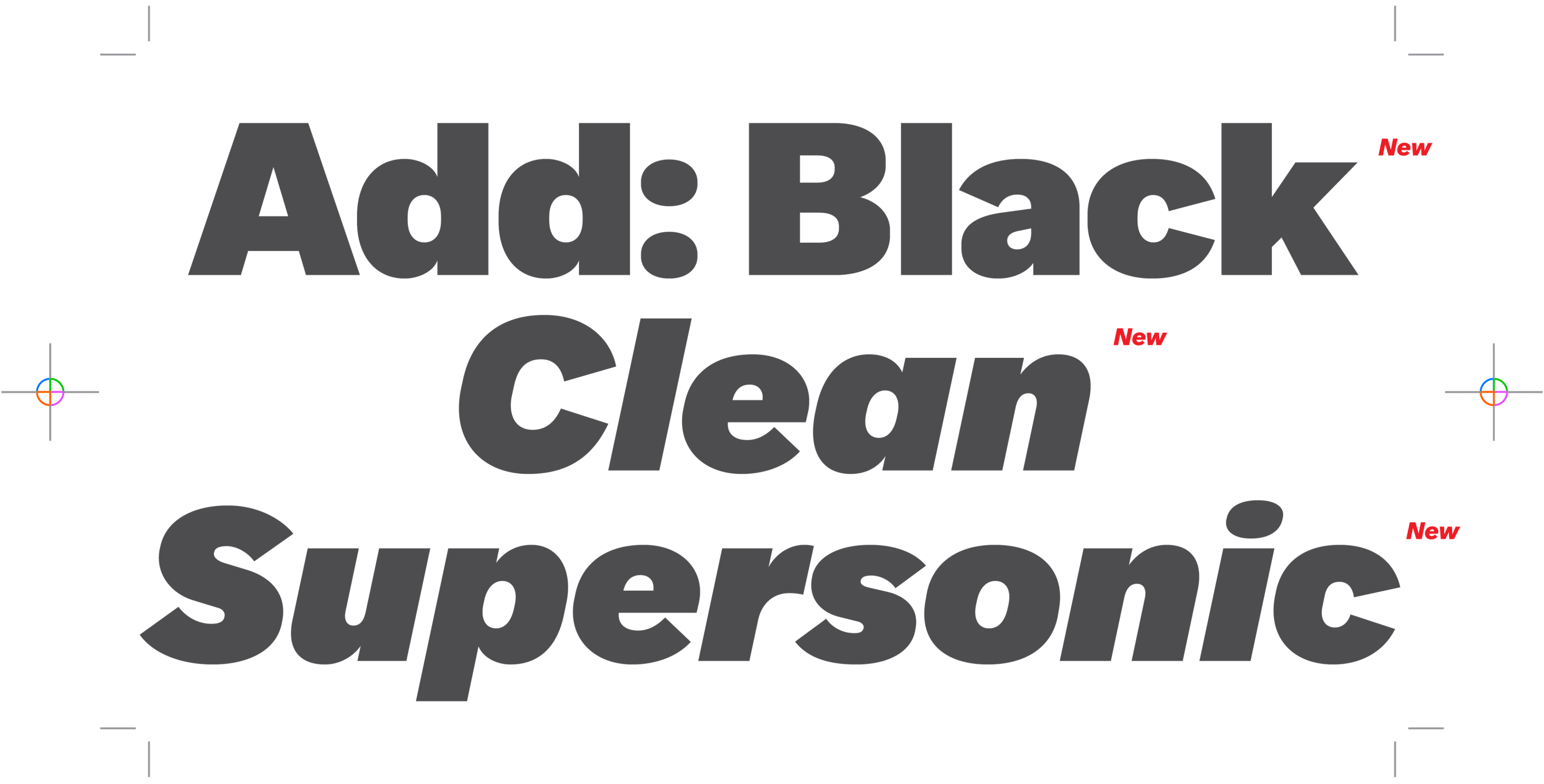
Fast forward to 2025: the renovation was outlined in three main phases.
Add Matex italics
Extend the family’s weight to Black
Expand and rearrange the stylistic alternates into clearly defined, conceptual sets.
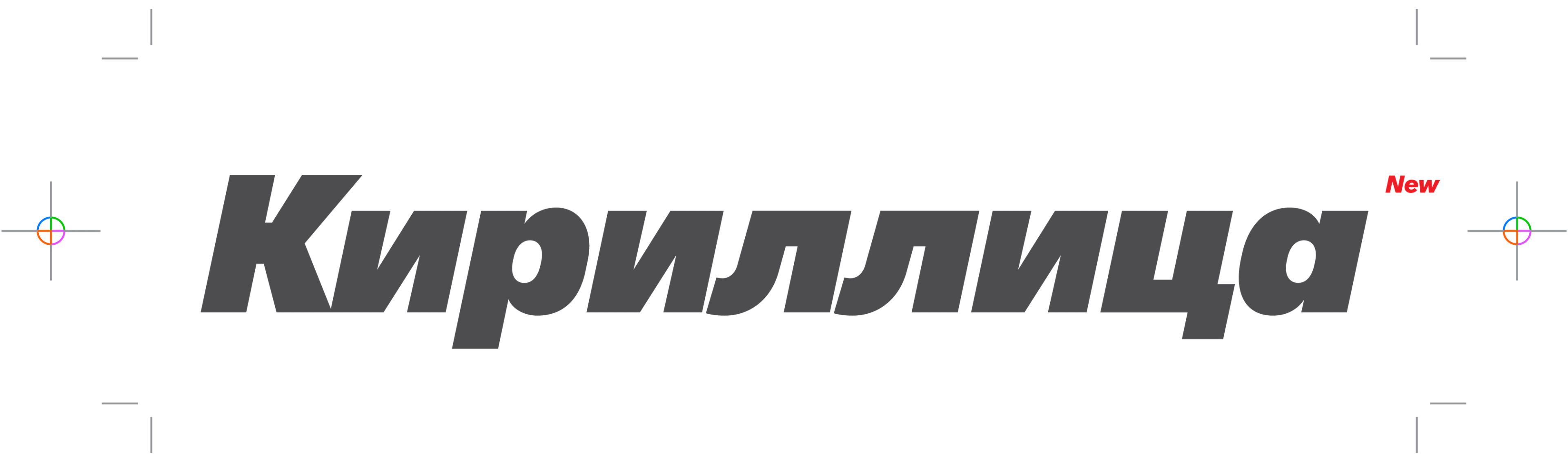
Hiring the right architect for this kind of overhaul was crucial, so we passed the Matex keys on to Samara Keller and left them in good hands. The Swiss type designer injected the required clarity, efficiency and longevity to see the task through. Matex’ renewal grew larger and larger as the project ticked along: we also added a full set of Extended Cyrillic and increased the number of planned alternate characters.
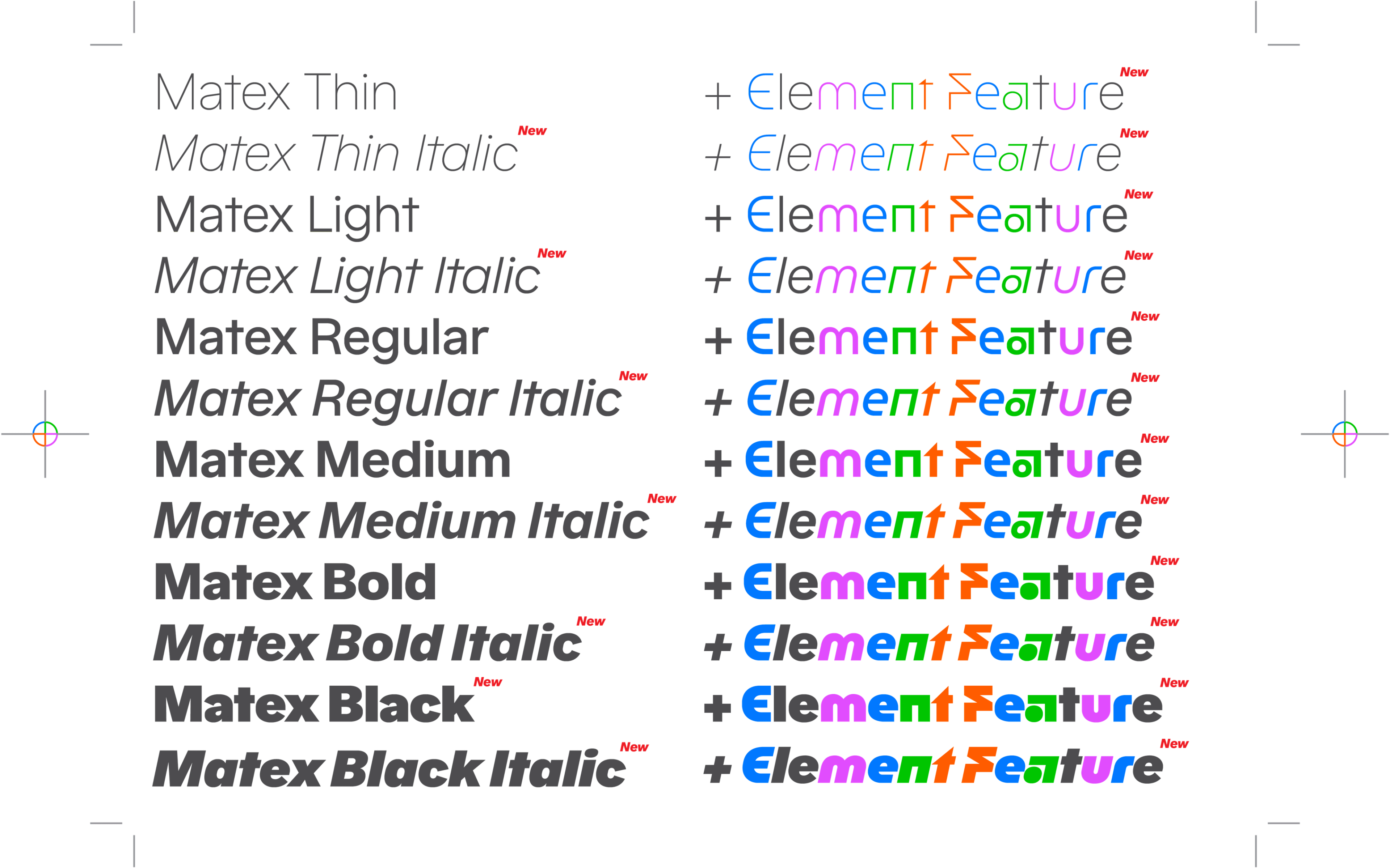
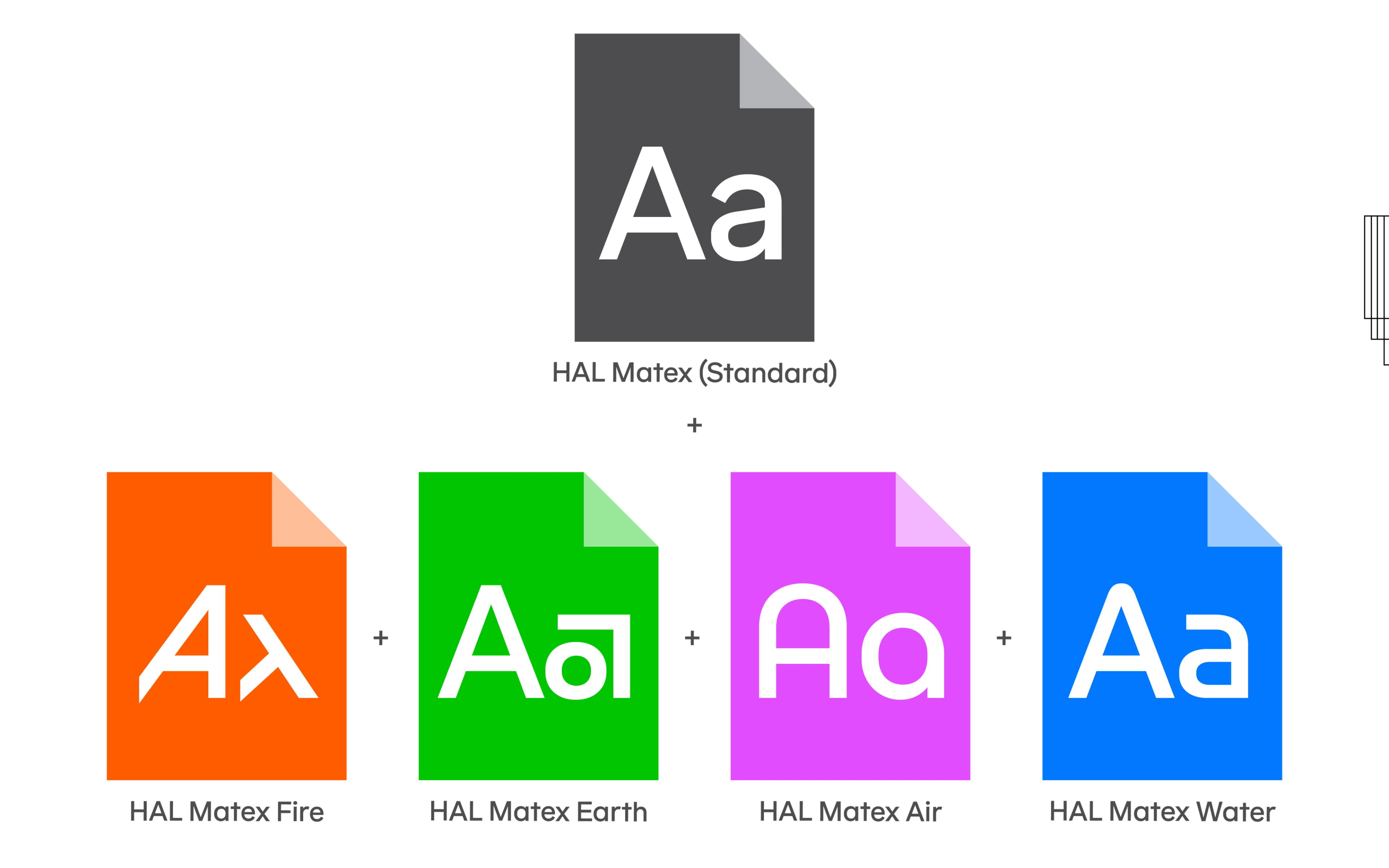
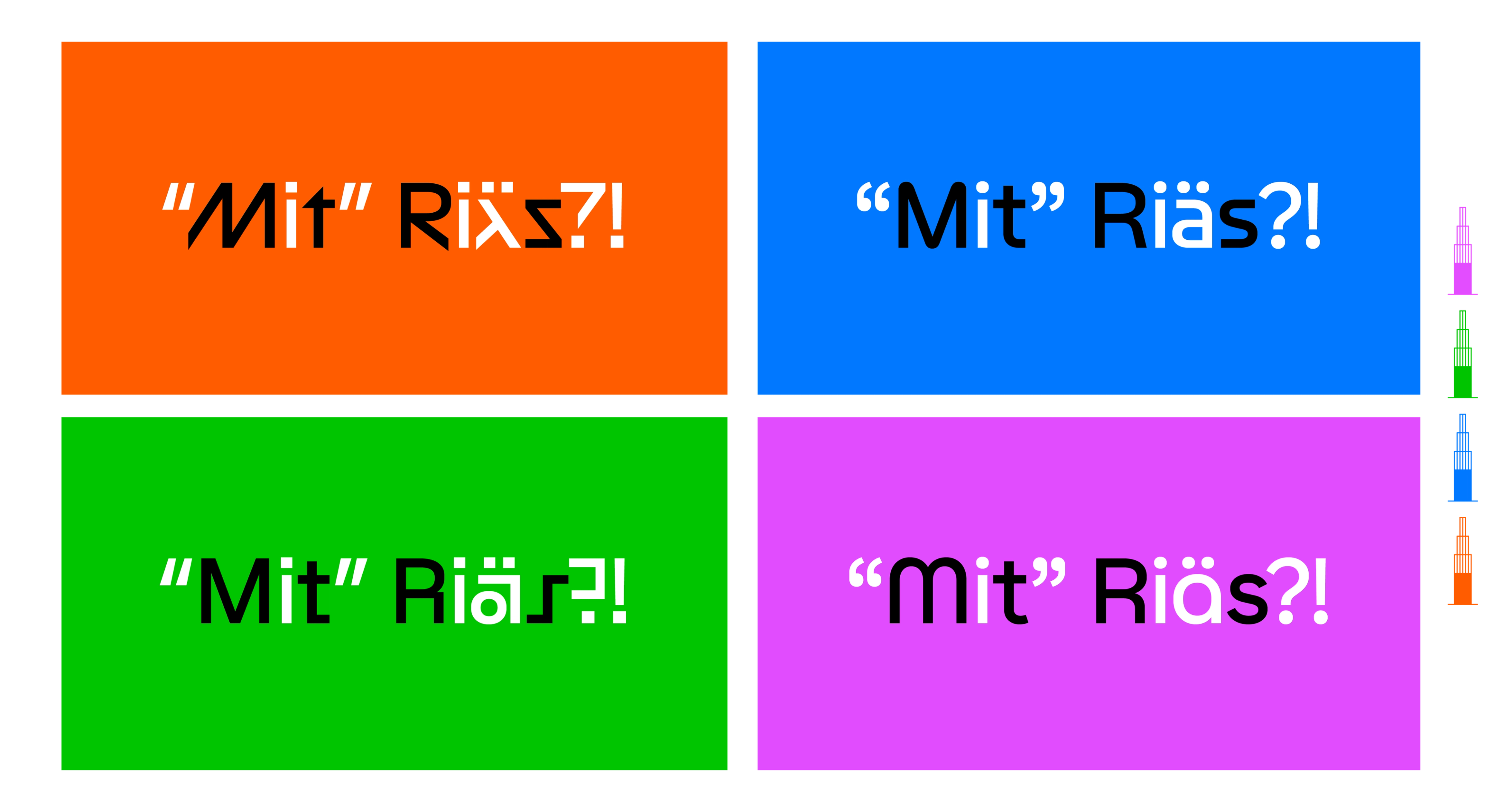
In total, the new Matex now counts over 100 stylistic alternates for alphanumeric characters; it’s by far the our largest typeface by glyph count with nearly 2100. In order to comprehensively group and organise all of these alternates we adopted the ancient concept of the “classical elements”. May I introduce you to: Matex Air, Matex Water, Matex Earth and Matex Fire. Each set is arranged to include alternates that are stylistically and aesthetically related. Furthermore, each set includes at least 20 or more alternates, meaning that their expressive appearance is uniquely different to the main typeface. It’s Matex but with various, unique facial expressions or like a superhero with five alternate costumes. You’re basically getting five different typefaces in one. Matex Standard will include the four elements as stylistic sets, activated via OpenType features. Additionally and for improved accessibility, static files are also provided, so for instance: when you purchase a license for Matex Regular, your download will also include four static font files, one for each element.
Ancient Greek and Eastern philosophies described the classical four elements as the basic building blocks of all matter and nature. Archaic cultures in Greece, Angola, Tibet, India, Mali, etc. had similar lists that referred to and used earth, water, fire and air to explain a wide range of natural phenomena, as well as addressing theories in cosmology, mythology and geology. It’s apparent that early civilisations from diverse parts of the globe followed the basic human desire to observe patterns, understand natural processes and define elemental structures. Thusly, these four basic properties were established as a kind of proto-periodic table long before the advent of chemistry and atomic science. Traditional Chinese and Japanese philosophical concepts also propagate a set of basic substances that include the four elements or similar variations (such as wind, smoke, soil, ash). ❶ Early Buddhist texts follow an interesting approach of designating the four primary material elements as Mobility, Fluidity, Solidity and Temperature, represented by earth, water, fire and air, respectively. These fit nicely to the visual characteristics of the Matex Elements: the lightness and flexibility of Matex Air, the smoothness and tranquility of Matex Water, the sturdiness and stability of Matex Earth, and the temperament and eccentricity of Matex Fire.
Mobility
Matex Air is visually most related to the original spurless or stemless alternates of the typeface’s initial release. Its nickname is the “Bauhaus” set for obvious reasons.
Fluidity
The Matex Water characters resemble pipes with soft bends and round joints, most famously embodied by the 1975 modernist NASA “worm” logotype ❷ or Teruoki Yagi’s eponymous type family of the late 60’s. ❸
Solidity
Matex Earth adds square-shaped alternates and solid 90° angles.
Temperature
Finally, Matex Fire introduces many eye-catching characters with acute angles and diagonal forms. Each one delivers a distinct style and visual flavour to the group. Together, they convey a very diverse set of typographic emotions and personalities. Don’t forget: all of these stylistic alternates are available in both upright and italic across six weights (Thin, Light, Regular, Medium, Bold, Black).
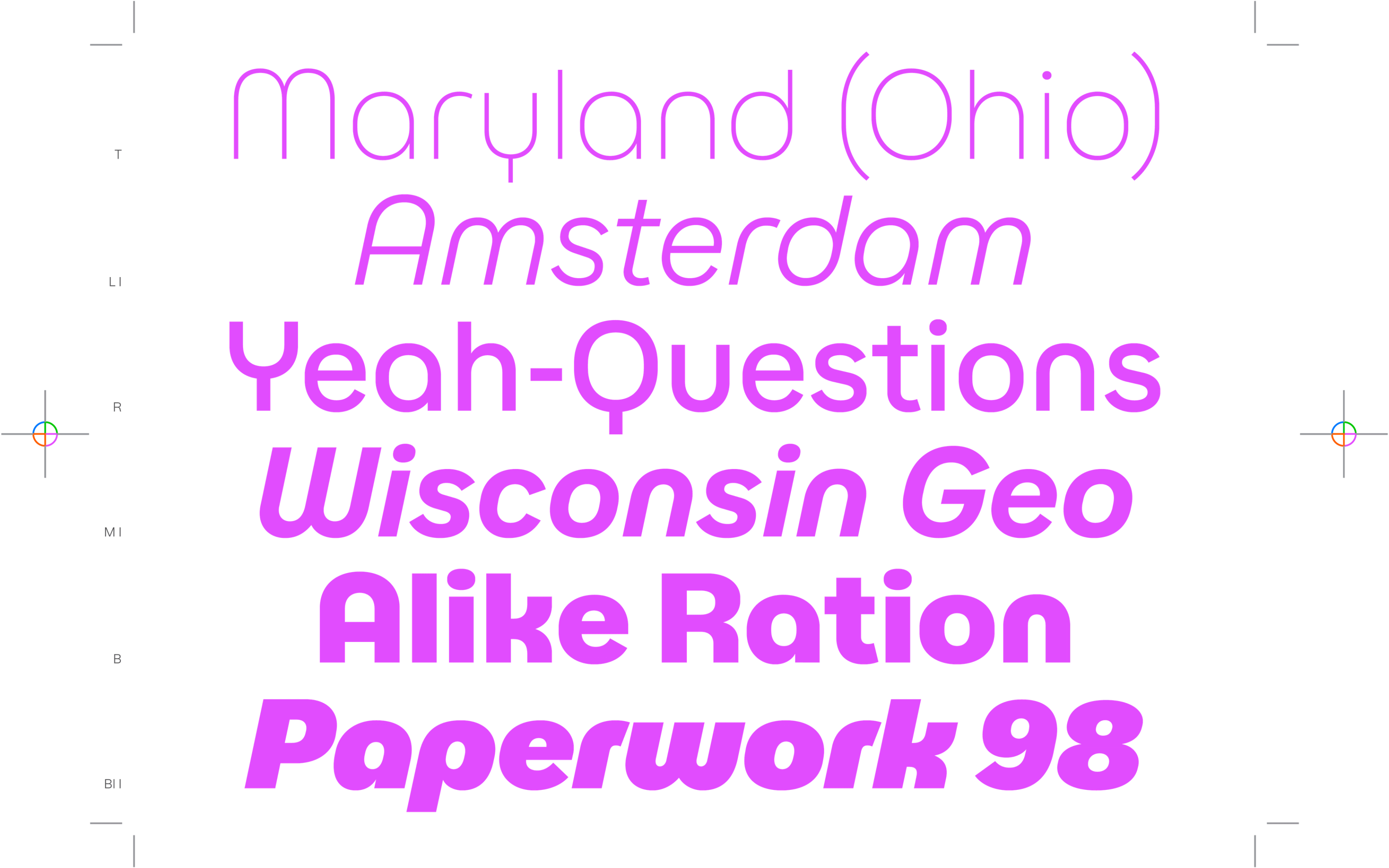
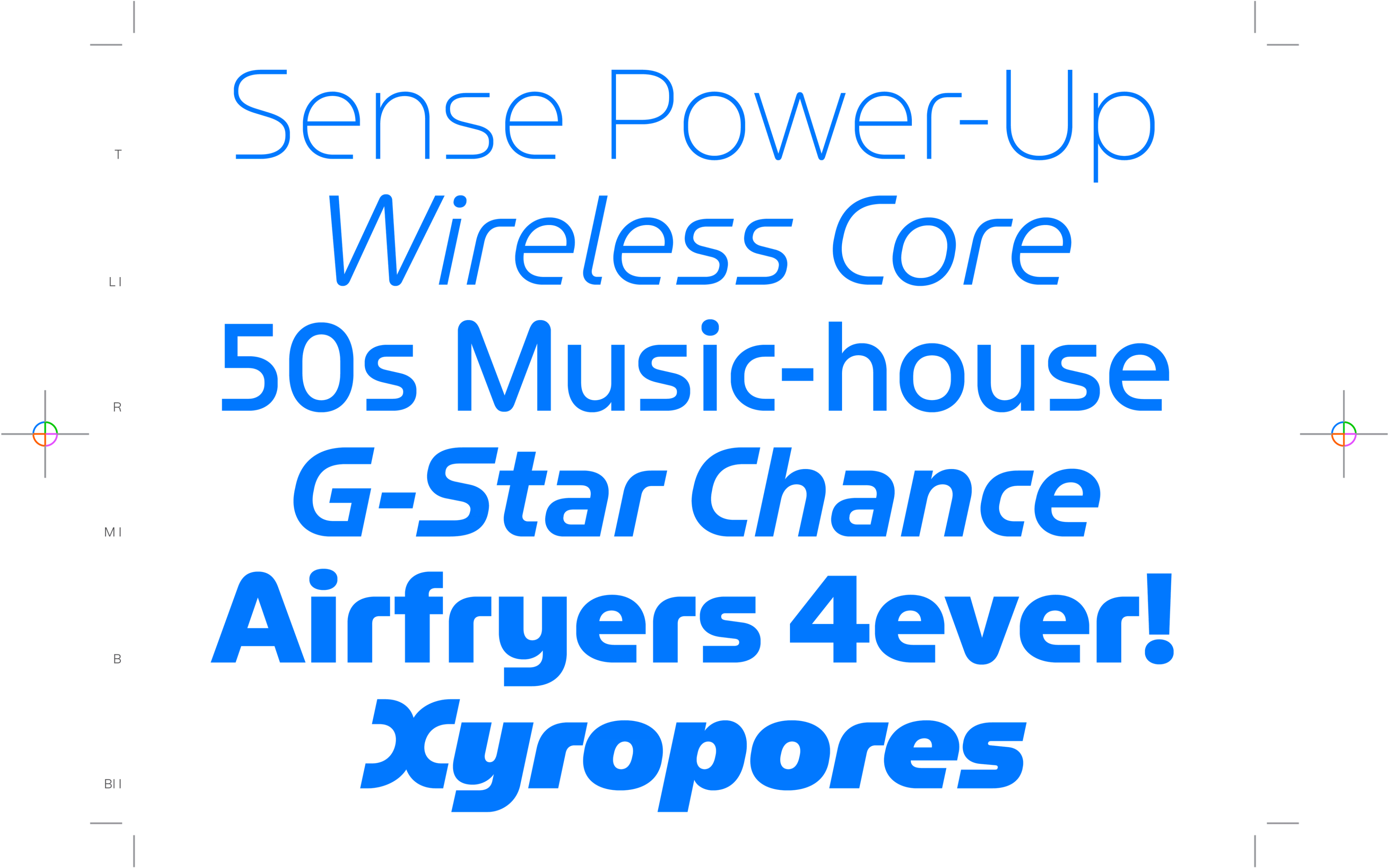
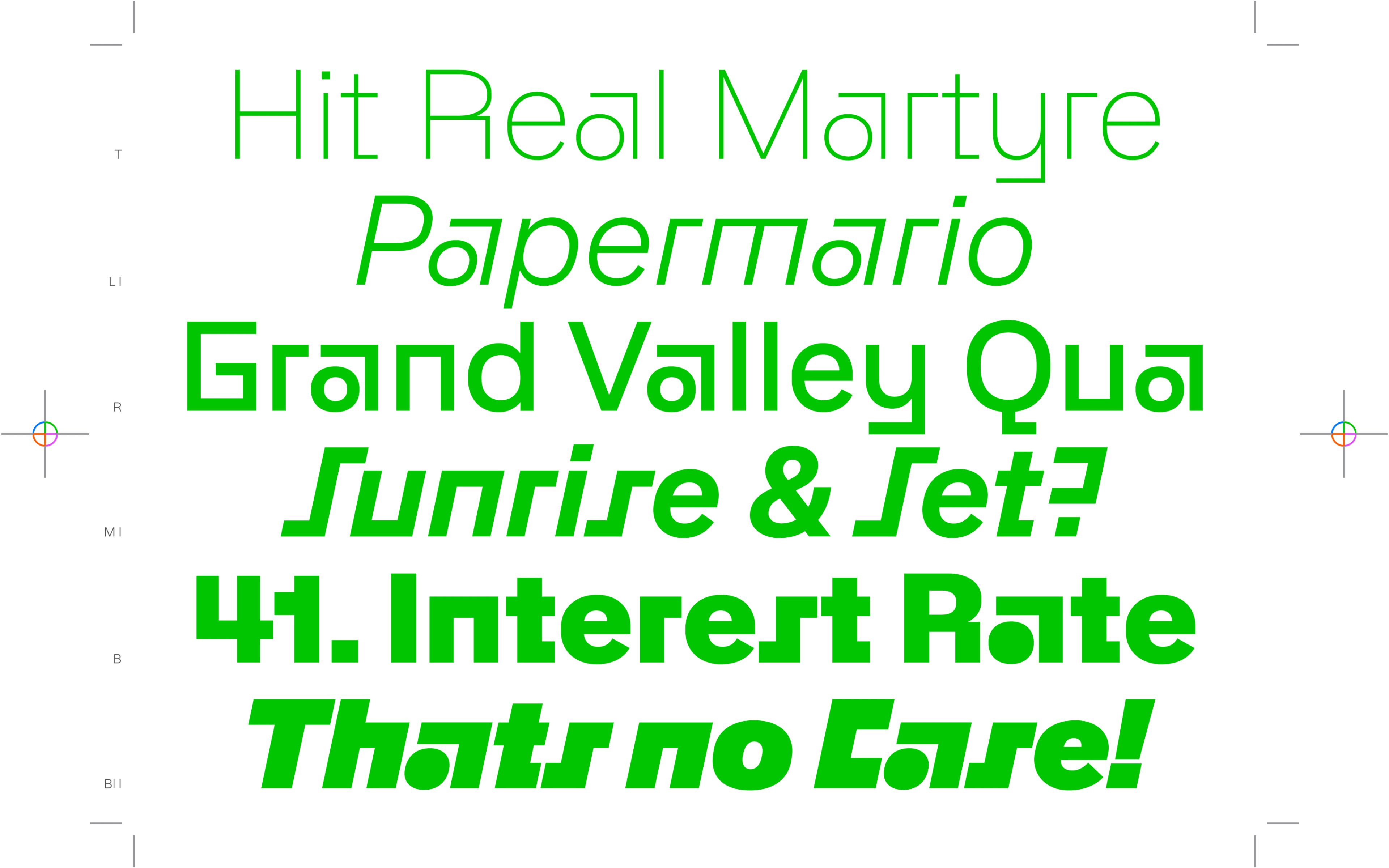
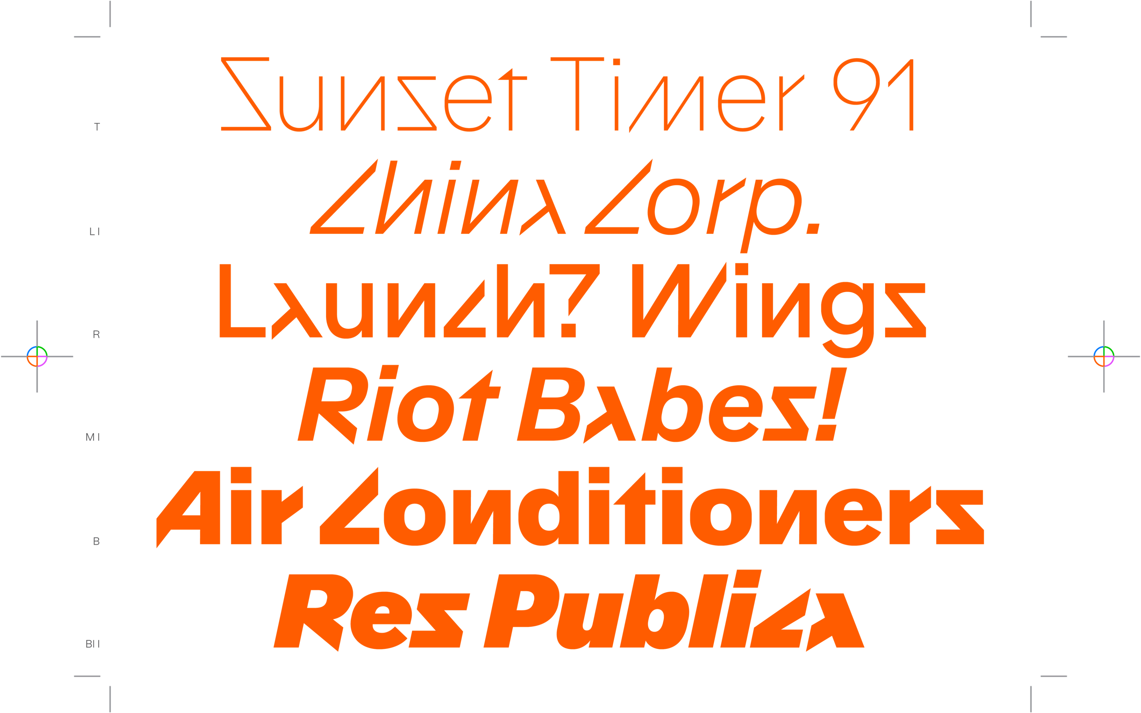
Another relevant stylistic set in the OpenType features is the one for alternative punctuation. Instead of round forms, it renders square alternates for various punctuation and diacritics. We recommend using the square punctuation with Matex Earth and Matex Fire. And there’s also a stylistic set for the alternative lowercase single-story ‘a’. In summary, the advanced Matex is now equipped with both Latin and Cyrillic scripts, covering more than 500 languages, including Vietnamese (that’s approximately 3.3 billion speakers worldwide). It has 6 weights, including the fresh Black cut, and full italics across all styles, scripts and elements. If that’s not enough, the Matex variable font is also available, which encompasses the entire family in one file.
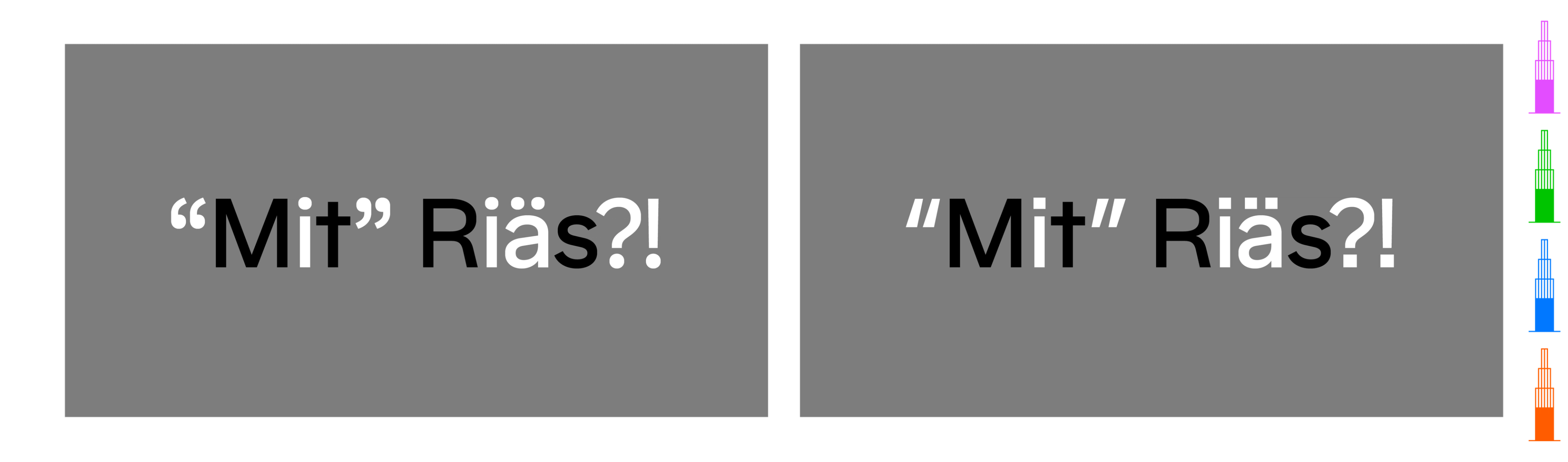
Matex is completed with enhanced functionality. Its generous counters and friendly yet clear appearance yields a sharp, sincere and practicable sans-serif for both reading and display texts. It dawned on me recently, that it shares some resemblance to Avenir. It’s a mouthful, but I’ll say it anyway: Matex can be considered a 21st-century Avenir, but with a bit more attitude, personality and utility. Don’t get me wrong, Avenir is a work of art, a stroke of genius, a magnum opus. Adrian Frutiger specifies it as his finest work:
I just wanted to bring a bit of humanity to the field of geometric types. Avenir wasn’t a success at first. […] When a letter shape really works, when you can say “that’s it”—that really is a joy. […] It’s all subjective, I can’t describe it other than a feeling. The quality of the draughtsmanship—rather than the intellectual idea behind it—is my masterpiece. […] It was the hardest typeface I have worked on in my life. Working on it, I always had human nature in mind. And what’s crucial is that I developed the typeface alone, in peace and quiet—no drafting assistants, no-one was there. My personality is stamped upon it. I’m proud that I was able to create Avenir. ❹
There you have it. Who would have thought that Avenir is the typeface that gave Frutiger the most pride? We’re also proud of Matex and I hope you enjoyed this little excursion into its development and design. Free trial fonts are available (the standalone static font files of the Matex Elements as well, by the way), so go ahead and give it a try. I will sign off with some lyrics from the 1979 song “In the Stone” by Earth, Wind & Fire:
Do you believe in what you claim?
People of the world all doubt the same.
Bringing questions of their own,
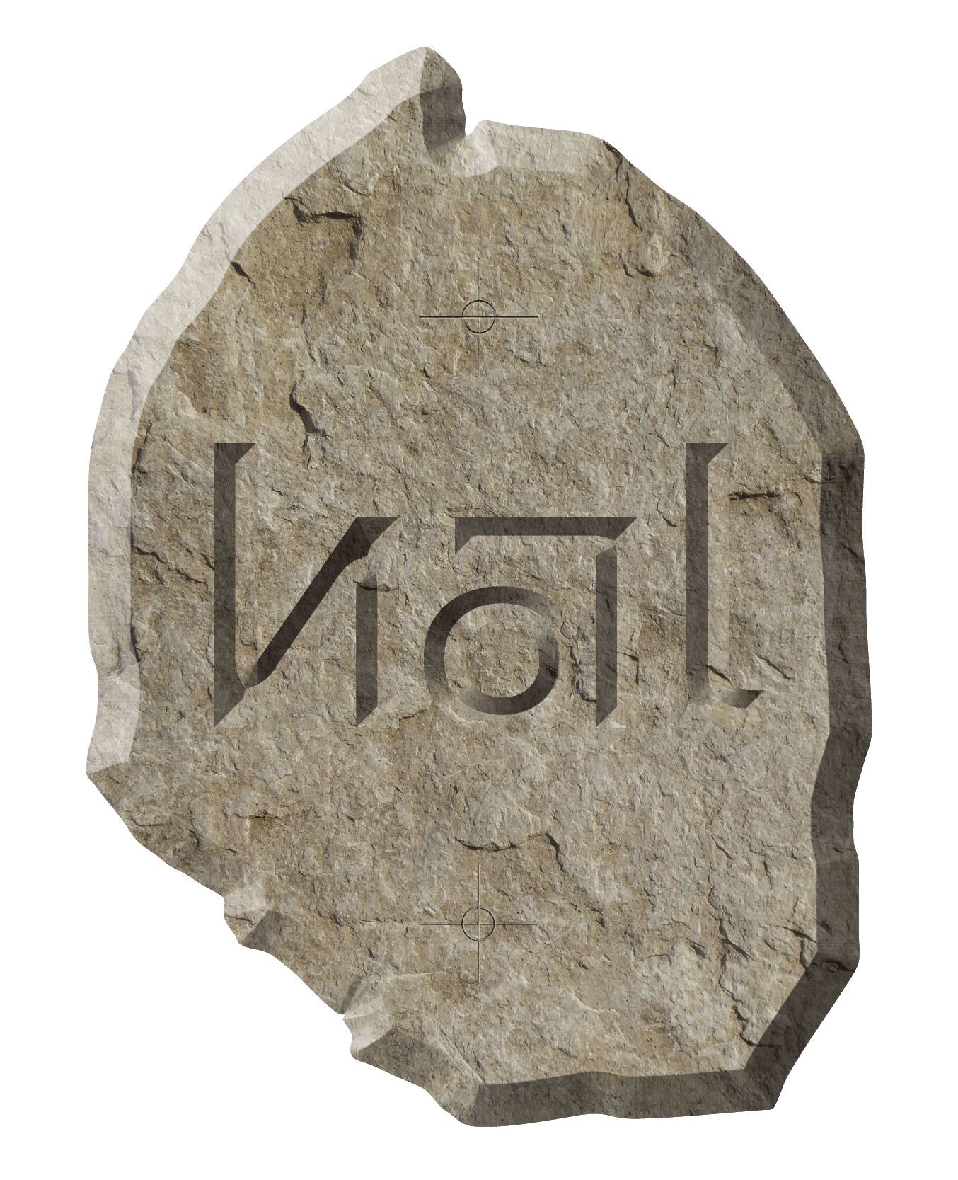
Truth is written in the stone.
Keep It Real,
Lucas from HAL Typefaces
- My most memorable, more contemporary interpretation of the four elements in popular culture is still the animated, environmentalist TV series “Captain Planet and the Planeteers” of the early 90’s.
- As part of a 1974 federal design initiative, NASA hired Richard Danne and Bruce Blackburn to create a modern logotype. Adopted in 1975, the resulting design featured stylised red letters without crossbars on the A’s, suggesting a rocket tip through negative space. The new logo was derogatorily nicknamed the “worm” by employees who preferred the old insignia.
- Designed by Teruoki Yagi, the “Yagi” type family was first published by FotoStar/Facsimile Fonts in the late 1960’s. The family included: Yagi Universal 1, Yagi Universal 2, Yagi Universal 3, Yagi Bold, Yagi Gothic, Yagi Modern, Yagi Double, Yagi Link Double, Yagi Link Light.
- Adrian Frutiger, Typefaces. The Complete Works, (Basel: Birkhäuser Verlag, 2008), p. 337.


